A redesign should start with evidence about where buyers are getting lost, not a new visual direction. This guide gives founders and small teams a 17-check audit that separates message, trust, usability, performance, lead-capture and measurement problems before money is committed to a rebuild. 
Editorial promise#
This article focuses on service-business conversion as an end-to-end operating path. It deliberately avoids universal conversion benchmarks and revenue promises because traffic quality, offer-market fit, sales cycle and follow-up differ by business.
The Sazvara framework#
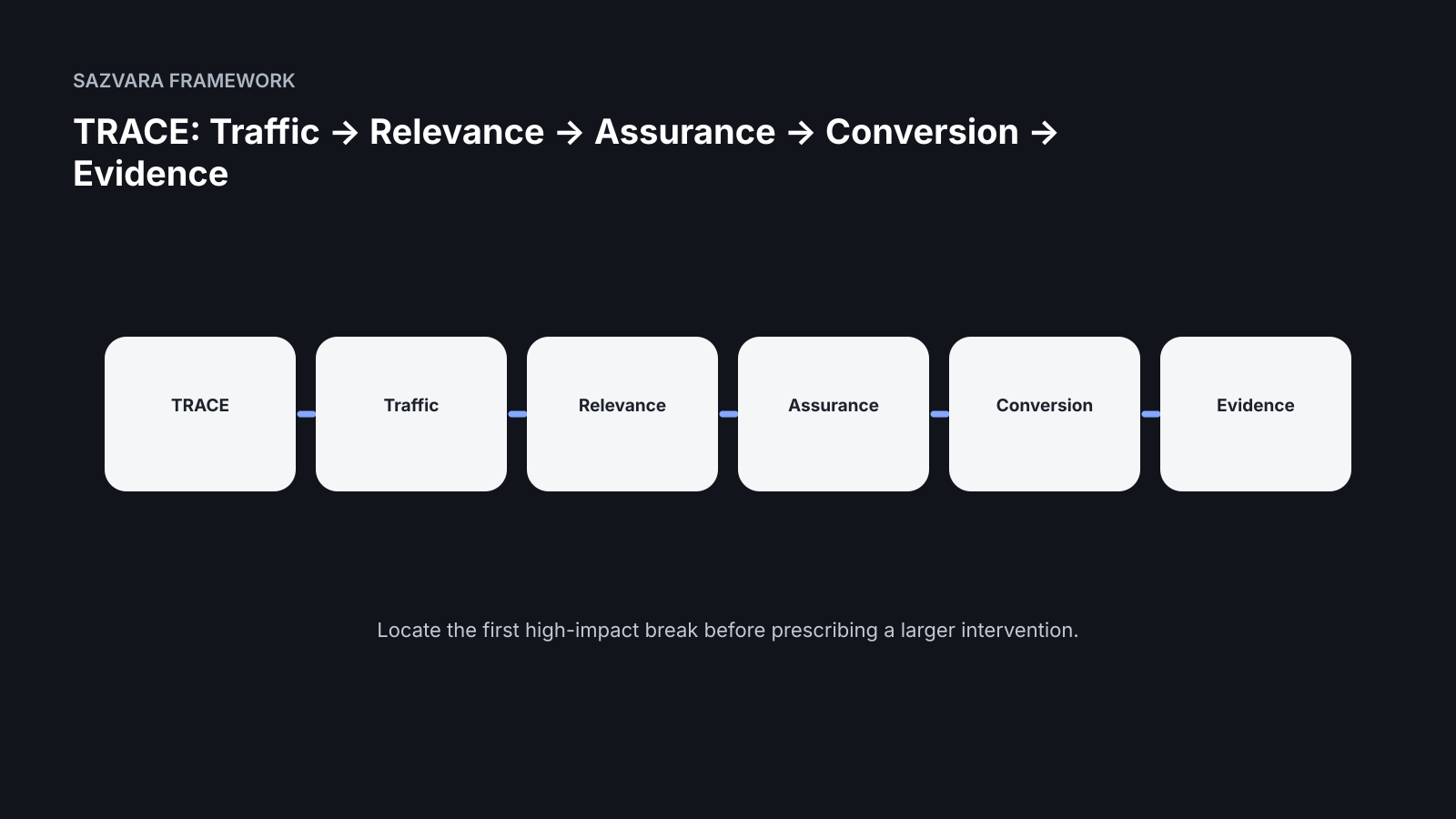
TRACE: Traffic → Relevance → Assurance → Conversion → Evidence
The short answer#
Do not redesign a business website because it feels old. Redesign when evidence shows that the current site cannot communicate the offer, establish trust, support the buying path, or be maintained without unacceptable friction. A conversion audit should come first because the same symptom—few enquiries—can be caused by very different failures.
A useful audit follows the buyer from arrival to measurable outcome. Sazvara uses a simple sequence: Traffic, Relevance, Assurance, Conversion, Evidence. The point is not to produce a giant marketing report. The point is to identify the smallest set of changes most likely to remove commercial friction.
Evidence anchors#
- Google helpful-content guidance — Useful pages should be created for people first, with clear purpose and original value.
- Google structured-data guidance — Structured data can help search systems understand eligible page content, but it does not replace the page itself.
- Google canonical guidance — Canonical signals help consolidate duplicate or near-duplicate URLs when a site has overlapping variants.
- Core Web Vitals — User-centered performance measures are useful for the pages where buyers read, interact and submit.
- W3C forms tutorial — Accessible form labels, instructions and concise data collection improve usability for a wider range of visitors.
- W3C WCAG overview — Accessibility should be treated as a design and interaction requirement rather than a final scanner pass.
- OWASP input validation — Server-side validation remains necessary even when browser-side checks improve the user experience.
- OWASP logging guidance — Operational logging should support investigation while avoiding unnecessary sensitive data.
- MDN constraint validation — Browser validation has defined capabilities and limitations that should be understood when designing forms.
- Google Search Essentials — Search visibility still depends on crawlable, useful pages and sound technical foundations.
1. Check whether the page matches the visitor's reason for arriving#
A landing page cannot convert consistently when the promise in search, outreach or referral traffic does not match the first screen. Compare the visitor's likely question with the headline, supporting copy and first visible action. A page about automation services should not open with abstract statements about innovation; it should quickly explain what is fixed, built or improved, for whom, and what happens next.
Review the top acquisition routes separately. A visitor arriving from a WordPress-rescue article has a different context from someone arriving from a founder profile or a direct referral. The page does not need dozens of variants, but it does need a clear information scent that tells each visitor they are in the right place.
2. Test the offer for specificity#
Strong conversion begins with an offer that can be understood without a sales call. Identify the problem boundary, the deliverable, the expected decision or outcome, and the next step. Replace broad phrases such as “digital transformation” with bounded language such as “diagnose why leads are being lost between your website form and CRM” or “stabilize an inherited WordPress site before making feature changes.”
Specificity also protects margins. When the website makes the scope legible, the first conversation can focus on fit instead of unpacking vague expectations. This is especially important for small service businesses where the founder is still involved in sales.
3. Measure trust gaps, not just design polish#
Buyers look for evidence that reduces perceived risk. Check whether the page makes ownership, process, constraints and proof visible. Useful trust signals include named authorship, real work examples, a clear delivery process, technical standards, source-backed claims and honest statements about what is not included.
Avoid substituting generic badges, inflated metrics or invented testimonials for evidence. A sparse but verifiable proof trail is commercially stronger than decorative credibility. If case evidence is limited, publish your operating standards, diagnostic methods and acceptance criteria.
4. Audit the primary action#
Every commercial page should have one dominant next step that matches the visitor's level of intent. “Contact us” can be too broad. A diagnostic request, rescue assessment, architecture review or scoped discovery call tells the buyer what the interaction is for.
Check the CTA label, placement, surrounding reassurance and destination. The best button copy cannot rescue a confusing form or a calendar flow that asks for too much too early. Follow the full path on mobile and desktop as if you were a first-time buyer.
5. Treat forms as revenue infrastructure#
A form is not successful because a confirmation message appears. The submission needs durable receipt, validation, routing, ownership, failure visibility and a recovery path. Test invalid input, duplicate submissions, delayed downstream systems and notification failures.
Record what happens after submission: where the lead becomes the system of record, who is responsible for the next action, and how an operator can discover that something broke. This connects conversion optimization with operational reliability instead of treating them as separate disciplines.
6. Check performance where it affects the decision path#
Performance should be measured on the pages and interactions that matter commercially. Large hero media, blocking scripts, layout shifts and slow form interactions create friction even when the design looks impressive in a static review.
Use field-oriented performance data when available and lab tests for diagnosis. Prioritize fixes that improve the buyer journey: loading the main content quickly, preventing layout movement around CTAs, and keeping interactions responsive.
7. Verify mobile hierarchy#
Do not treat mobile as a compressed desktop layout. On a narrow screen the order of information becomes the strategy. Confirm that the offer, proof and next step appear in a useful sequence and that sticky elements do not cover content or controls.
Test with real devices when possible. Pay special attention to form keyboards, tap targets, menu behavior, embedded scheduling tools and long comparison tables.
8. Find navigation dead ends#
A content-rich site often loses buyers because articles, service pages and proof pages form separate islands. Map the paths from each major article to a relevant service, case or diagnostic. Then map the reverse path: can a service-page visitor find deeper evidence without hunting?
Internal links should reduce uncertainty, not exist only for search engines. Use descriptive anchor text and place links at decision points where the next question naturally appears.
9. Audit message duplication#
When every page repeats the same claims, the site feels larger without becoming more useful. Give each page a job. A homepage frames the business; a service page explains a bounded offer; a case page shows evidence; an article answers a difficult question; a contact page reduces friction around the next action.
Duplicate positioning also creates search cannibalization. Consolidate pages that target the same intent unless they genuinely serve different audiences or stages.
10. Check search-result packaging#
Review titles and descriptions as part of conversion, not as a separate SEO task. A ranking is only valuable when the snippet earns the right click. Titles should make the query and decision clear without becoming clickbait.
Use canonical URLs consistently, keep index directives intentional, and include structured data that accurately describes the page. Search enhancements cannot compensate for weak content, but clean packaging helps useful pages be understood.
11. Check accessibility barriers#
Accessibility problems are also conversion problems. Labels, contrast, focus order, keyboard access, meaningful headings and clear error messages help more people complete the journey and usually improve usability for everyone.
Do not reduce accessibility to an automated score. Automated testing finds some classes of defects, while keyboard testing and human review expose interaction problems that scanners miss.
12. Inspect the evidence chain#
For every important claim, ask what a skeptical buyer could inspect next. A claim about reliability can link to a delivery standard; a claim about WordPress rescue can link to a detailed rescue framework; a claim about automation can link to validation and measurement guidance.
This creates a compounding content system: commercial pages stay concise while deeper articles carry the reasoning and implementation detail.
13. Measure the funnel you actually have#
At minimum, distinguish article views, service-page visits, CTA clicks, form starts, submission attempts and successful submissions. Without this, “traffic” becomes a misleading success metric.
Use the measurements to locate friction. A page with healthy traffic and no service clicks needs a different fix from a page with strong CTA engagement but failed submissions.
14. Separate conversion defects from traffic defects#
If nobody reaches the page, conversion work alone will not create demand. If qualified people reach it and leave, more traffic can amplify waste. Diagnose acquisition and conversion as connected but distinct systems.
This distinction prevents teams from rebuilding a site when the immediate problem is distribution—or buying more traffic when the actual problem is offer clarity.
15. Score changes by evidence, impact and reversibility#
Create a short backlog and score each change on three dimensions: how strong the evidence is, how close the issue is to revenue, and how safely the change can be tested. High-evidence, high-impact and reversible changes should move first.
Examples include clarifying a service headline, repairing a broken lead route, reducing form friction or linking a high-intent article to the matching diagnostic.
16. Decide whether you need optimization, redesign or rebuild#
Optimization is appropriate when the platform is healthy and the problems are mostly content, hierarchy or measurement. Redesign is appropriate when the structure works but visual and interaction patterns block understanding. Rebuild is justified when the underlying implementation prevents safe change, performance, accessibility, integration or ownership.
Make this decision after the audit. Otherwise “redesign” becomes a container for unrelated technical and commercial problems.
17. Define the post-change proof#
Before implementing the work, define what evidence will count as improvement. That might be a higher article-to-service click rate, more completed diagnostics, fewer form failures, faster key pages or improved qualified-enquiry rate.
Avoid promising revenue from a visual change in isolation. The site participates in a larger system that includes traffic quality, offer-market fit, follow-up speed, pricing and sales execution.
A practical 90-minute founder audit#
Start with five pages: homepage, highest-value service page, best proof page, highest-traffic article and contact/diagnostic page. Walk the TRACE sequence for each. Record one major friction point and one measurable test per page.
At the end, choose no more than three immediate interventions. A useful audit should create focus, not a 70-item backlog that nobody owns.
Where Sazvara fits#
Sazvara's role is strongest when conversion problems cross the boundary between website, automation and operational reliability. That includes unclear service paths, forms that do not create durable leads, fragile integrations, inherited WordPress systems and sites that cannot be changed safely.
The commercial next step should therefore be bounded: diagnose the highest-risk conversion path, document the evidence, and decide whether the right action is optimization, rescue, redesign or rebuild.
What good looks like in practice#
A strong conversion system feels coherent from the visitor’s first question to the team’s first human response. The page does not need to answer everything, but it should make fit, proof and the next action obvious. The form should ask only for information that changes routing or preparation. Once submitted, the enquiry should become a durable record that can be traced without searching multiple inboxes. Measurement should show where qualified progression stops, not merely how many sessions occurred.
For a founder, “good” is a small set of pages with clear jobs and a small set of events with clear meanings. The homepage frames the business. Service pages explain bounded offers. Proof pages reduce risk. Articles answer difficult questions. The diagnostic or contact path turns intent into an owned operational event. This structure makes optimization easier because each failure has a narrower set of plausible causes.
Decision table#
| Signal | What it usually means | First action |
|---|---|---|
| Qualified traffic is low | Acquisition/distribution problem | Do not blame conversion yet; establish demand and entry-page visibility. |
| Traffic is relevant, offer is unclear | Message/positioning problem | Clarify buyer, problem boundary, deliverable and next step. |
| Offer is clear, trust is weak | Evidence problem | Add real work, operating standards, named ownership and verifiable proof. |
| CTA interest is healthy, form starts are weak | Interaction/friction problem | Reduce uncertainty and unnecessary fields; improve CTA-to-form continuity. |
| Form starts are healthy, receipts are weak | Intake reliability problem | Repair durable receipt, validation, routing and failure visibility. |
| Path works but page is slow | Performance constraint | Fix the proven bottleneck on the commercial path before broad redesign. |
Worked scenario#
A professional-services firm has steady referral traffic and several detailed service pages, but the diagnostic form receives very few completions. The instinct is to commission a new homepage. A TRACE audit shows a different sequence: visitors reach the right pages, understand the broad category, but cannot tell which engagement fits their situation. The CTA says only “Contact us,” and the form asks for nine fields before explaining what happens next. The form also depends on an email notification that has no durable record or failure alert.
The first release therefore does not redesign the site. It introduces clearer service boundaries, replaces the generic CTA with a diagnostic-specific action, reduces the form to the information needed for routing, creates durable submission receipt, and instruments the path from service page to successful intake. Only after those changes does the team have evidence about whether visual redesign is still the constraint.
Implementation sequence#
Week one should establish the baseline and fix broken measurement. Week two should address message-to-offer alignment and CTA clarity on the highest-value pages. Week three should repair the intake path and internal-link structure. Visual refinements can then be tested against a working commercial path rather than used as a substitute for one.
Keep the implementation reversible. Headline, hierarchy and CTA tests should be easy to change. Form-routing changes should have logs and rollback. Large template or platform changes should wait until the smaller interventions have been measured.
Measurement plan#
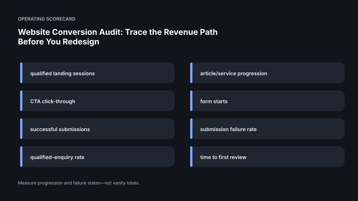
Track qualified landing sessions, service-page progression, CTA clicks, form starts, successful submissions, form failure rate, qualified-enquiry rate and time to first human review. Pair these with Core Web Vitals and error data on the same commercial pages. A useful dashboard should show the path, not just totals.
Interpret the numbers in sequence. If service clicks rise but successful submissions do not, the next investigation belongs in the intake layer. If submissions rise but qualified conversations do not, the offer or qualification may be wrong. If traffic is negligible, conversion work has reached the limit of what it can prove.
Operating scorecard#
| Measure | Why it matters |
|---|---|
| qualified landing sessions | Separates useful demand from raw traffic. |
| article/service progression | Shows whether education creates service evaluation. |
| CTA click-through | Shows explicit movement toward the next step. |
| form starts | Identifies intent before submission. |
| successful submissions | Confirms the commercial path actually completes. |
| submission failure rate | Surfaces hidden intake defects. |
| qualified-enquiry rate | Connects web activity to commercial fit. |
| time to first review | Measures operational follow-through. |
Common mistakes to avoid#
Common mistakes are redesigning before measuring, changing the offer and the interface at the same time, treating all traffic as equal, using a homepage-wide conversion rate, adding social proof that cannot be verified, and declaring success from a better Lighthouse score. Another failure is creating so many variants that the team no longer knows which version produced the result.
The remedy is disciplined sequencing: one commercial hypothesis, one bounded change, one observable outcome, and a record of what changed.
A second worked scenario: good traffic, weak qualified enquiry flow#
Consider a service business whose organic traffic is stable and whose homepage receives a healthy mix of branded and non-branded visits. The founder sees the traffic number and assumes the site needs a visual redesign because enquiries are inconsistent. A conversion audit should test that assumption before design work begins. Start by separating visitors who arrived for information from visitors who reached pages with clear commercial intent. Then inspect whether the offer on those high-intent pages states who the service is for, what happens next, and what evidence supports the promise.
Suppose the high-intent service page performs well until the visitor reaches the primary call to action. The button opens a long form that asks for information the sales team does not use, the mobile layout pushes the submit action below several optional fields, and the confirmation state does not explain when a response will arrive. None of those problems requires a new brand identity. They require a smaller, testable change to the conversion path. The redesign decision should therefore remain separate from the conversion-repair decision.
A useful evidence packet for this case would contain the page path, the visitor intent represented by that page, screenshots or recordings of the mobile and desktop action path, form field inventory, observed validation behavior, analytics events for form start and successful submission, and a short record of what changed. After the repair, compare the same events and qualitative failure signals rather than declaring success because the page looks cleaner.
The same discipline applies when the weakness appears earlier in the journey. If visitors reach a service page but repeatedly move back to generic navigation, the problem may be information scent or offer clarity. If visitors begin a form but do not complete it, the friction is later. If completed forms do not become visible to the team, the problem is operational reliability rather than page persuasion. A conversion audit earns its value by locating the failing boundary before prescribing the treatment.
Decision rule for founders#
Use redesign when visual hierarchy, trust presentation or interaction quality is the dominant constraint. Use restructuring when the content model and navigation are the dominant constraint. Use a technical rebuild only when the implementation prevents safe change, reliable measurement or required functionality. In every case, write the expected evidence before work starts so the team can distinguish improvement from preference.
Buyer checklist#
Before approving the work, confirm:
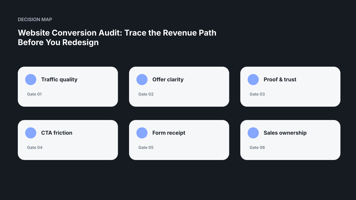
- The team can state the traffic quality condition in plain language.
- The offer clarity evidence is inspectable rather than assumed.
- Ownership for proof & trust is named.
- A failure involving cta friction has a defined response.
- The form receipt signal is measured after release.
- The team knows how sales ownership is restored or handed over.
Release / acceptance gate#
| Gate | Evidence required before calling the work complete |
|---|---|
| Message | A first-time visitor can explain the offer and intended buyer. |
| Proof | Important claims have inspectable evidence nearby. |
| Action | The primary next step is specific and appropriate to intent. |
| Intake | A valid submission creates a durable, traceable record. |
| Measurement | The path is instrumented from landing page to successful receipt. |
| Recovery | A failed intake or downstream step is detectable and recoverable. |
A conversion release should stop when the buyer path or intake proof fails, even if the page looks visually finished.
Related Sazvara guidance#
- /services/
- /work/
- /contact/
- /insights/website-form-to-revenue/
- /insights/automation-success-vs-business-success/
Editorial note#
External links support factual claims about search, accessibility, forms and web performance. The audit sequence, decision rules and worked examples are Sazvara operating analysis; they are not reported client outcomes or guaranteed conversion effects.
Sources and further reading#
- Google helpful-content guidance
- Google structured-data guidance
- Google canonical guidance
- Core Web Vitals
- W3C forms tutorial
- W3C WCAG overview
- OWASP input validation
- OWASP logging guidance
- MDN constraint validation
- Google Search Essentials
Next step#
Request a bounded website conversion diagnostic. Start with the highest-consequence path described in this guide, capture a baseline, and require observable acceptance evidence before expanding the scope.
Have a system that is stuck, manual or difficult to ship?
Sazvara diagnoses the system before prescribing the technology. Bring the constraints, failure modes and current state.